Forms
The goal of API Forms is to define the forms in such a way, that software (developing) companies can use it to automatically generate the actual forms. This should allow them to convert it into functionality for digital forms, a PDF-document or a new format that can be read by some other system. Essential to this approach, is that the way of storing the forms should be fully descriptive and structured, in order to have it processed by other systems.
Table of Contents
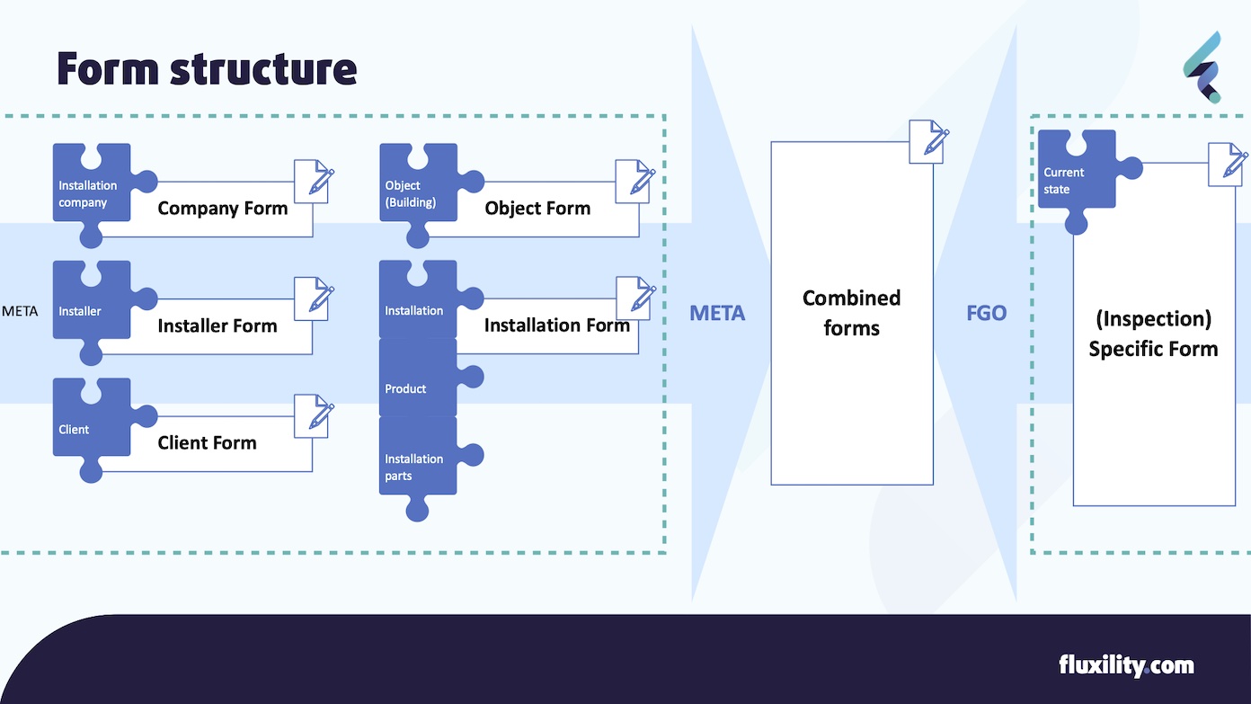
Form structure

Each form consists of the two sections. The meta-part and the specific form fields. The meta-part is always the same and consists of the following elements:
Which: Installation Company filled out the form
Who filled out the form: Installer
Who commissioned the assignment: Client
What Installation and what Object (installation implies object)
What date was this form filled out
When requesting a form, the meta-part fields are not provided by the API Forms. The meta information is not form-specific and is the same for every form. Most software will have a way to enter this information already, for instance using a CRM for clients. Please note that this information is or might still be required for producing the report. Have look at the naming standards and conventions section for information on the field names that you can use for these meta fields.
Form technology
The Form API makes use of Schema JSON for all definitions of data and also forms. This allows for each company to transform the document into a format that is usable by their application.
When defining the components, the naming conventions as used by FormIO. will be used. This means that the form will be interpretable by the Open Source solution FormIO (GitHub). If you use a different system like for instance React JSON Schema Form <https://github.com/rjsf-team/react-jsonschema-form>_ you can convert the JSON-file by replacing the components property with the properties.
Code Examples
A yes/no question using a Radio widget

{
  "key": "A-01",
  "label": "A-01 Functioneren ketel",
  "description": "Informatie van gebruiker",
  "tooltip": "Vraag bij de gebruiker na of de ketel onjuist functioneert en evt. opvolgende acties of controles uitvoeren.",
  "type": "radio",
  "values": [
    {
      "label": "Ja",
      "value": "ja"
    },
    {
      "label": "Nee",
      "value": "nee"
    },
    {
      "label": "Nvt",
      "value": "n.v.t."
    }
  ]
}
Textarea
{
  "input": true,
  "type": "textarea",
  "key": "situation",
  "label": "Beschrijf de situatie"
}
Textfield
For textfields there is an extra option ‘hasNotRelevant’ which displays a toggle. With this toggle, the user is able to mark this field as ‘not relevant’.
{
  "input": true,
  "type": "textfield",
  "key": "naam",
  "label": "Naam van opdrachtgever",
  "hasNotRelevant": true
}
Photo
{
  "label": "Foto",
  "key": "photoId",
  "type": "photo",
  "input": true
},
Repeating entries (Photo & Textfield)
{
  "key": "photos",
  "label": "Voeg foto's van de situatie toe",
  "itemLabel": "Foto",
  "reorder": false,
  "addAnotherPosition": "bottom",
  "defaultOpen": false,
  "type": "datagrid",
  "components": [
    {
      "label": "Foto",
      "key": "photoId",
      "type": "photo",
      "input": true
    },
    {
      "label": "Toelichting",
      "tableView": true,
      "key": "description",
      "type": "textarea",
      "input": true
    }
  ]
}